/show/open · 00:00:00
A show runs on time.
So does the brand.
This is the OSC⚡See brand book, laid out the way the product works: one timeline, read top to bottom. Every chapter is a cue. Scroll is the playhead.

/brand/premise
Timing is everything
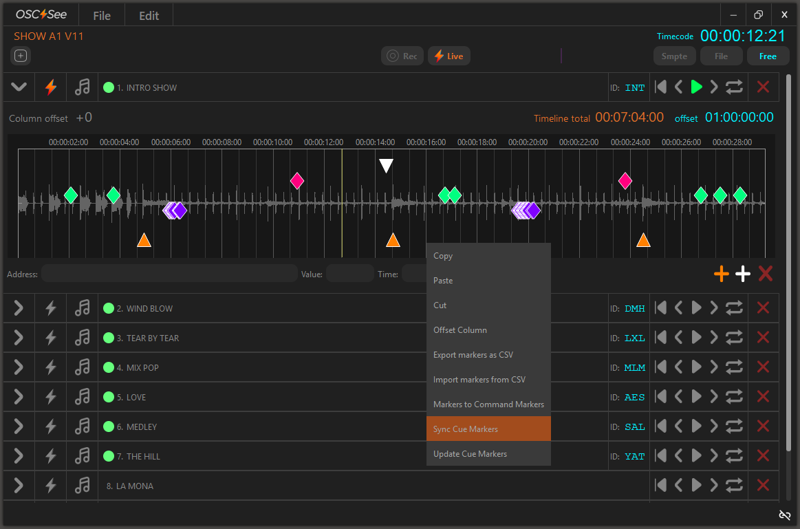
OSC⚡See is a timeline-based OSC command editor for live shows, audiovisual synchronisation and immersive experiences. It brings cue control, timeline playback and real-time flexibility to media servers like Resolume and MadMapper, without expensive hardware.
Sold direct, with a free mode. Built by Visual Lab and Pixel Space.
Made by people who run shows. We sell time saved and risk removed.
An independent tool, not approved by Resolume or Millumin.
Command Markers+ bring label-based sync to Resolume.
/brand/logo
Three lockups, one mark
Two pieces of artwork, both vector. The wordmark whenever the name appears as a mark, the bolt icon wherever the space is square or small. Place the supplied file; never redraw it, never set it in a typeface.


The unit is the bolt itself: one bolt above, one below, and one laid on its side at each edge. Nothing enters that band: no type, no image edge, no other logo. The band scales with the mark.
Wordmark: 120px on screen, 30mm in print. Below that, use the bolt icon alone — never smaller than 16px.

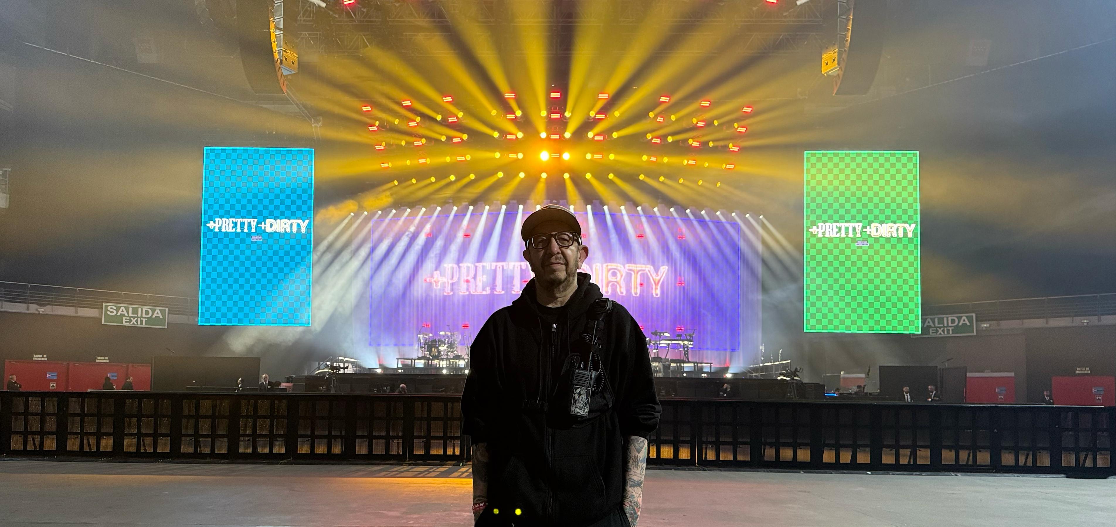
Where colour is not available — one-colour print, engraving, embroidery, a fax of a purchase order — the lockup runs in a single flat colour. Negative is white artwork on a solid dark field; positive is black artwork on a light field. Both keep the same safe area, and the bolt loses its gradient rather than switching to another colour.
Don't recolour the bolt, stretch or rotate the lockup, add a stroke, glow or drop shadow, put the grey wordmark on a dark field or the white one on a light field, box the mark in a shape of your own, or rebuild it in a typeface.
/brand/name
Two words and a bolt
Open Sound Control. Always set in caps, never spelled out in running copy.
The bolt sits between the words. Use the vector mark where available; U+26A1 stands in when it is not.
Sentence case. Never "SEE", never "see". The pair reads as one word: OSC⚡See.
Always bold italic. With the bolt between the words — OSC⚡See — or, where the bolt can't be set, OSC See.
Never plain roman in body copy, and never OSCSee · Osc See · OSC-See · oscsee.
/brand/colour
Two palettes, one spectrum
Purple carries the surface, cyan carries the action, orange carries the emphasis. One accent per screen.
Saturated values survive ink and fabric. Use these for anything printed, and for any new lockup.
On the site the spectrum rule runs. The four authored stops are mirrored into a loop — red, orange, violet, cyan, back again — the bar is drawn at four times its width and the background position slides one full cycle every twelve seconds. Linear, no easing, no pause: it reads as signal, not as decoration.
One ramp per screen, and it stops for prefers-reduced-motion. In print it holds still at the four authored stops.
/brand/type
Four voices in type
/brand/buttons
Buttons are square now
The pill is retired. Buttons on oscsee.com are near-square — 2px radius — set in Blinker, uppercase, with .12em tracking. Two fills only: orange for the action we want, an outline for everything else.
One per screen. The action we are asking for: download, buy, subscribe. The bolt glyph is optional and only ever sits on this one.
Everything that sits next to the primary. White at 40%, brightening to solid white on hover. Never two orange buttons side by side.
56px tall in a hero or a band, 42px tall in the header row. Nothing in between, and nothing smaller.
No lift, no shadow, no scale. The colour changes and that is all.
The cyan pill. Cyan is still the category colour in type and in the app, but it is no longer a button fill, and no button is round-ended.
/brand/markers
Shape carries the meaning
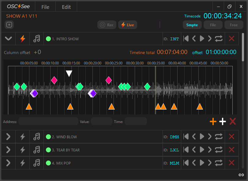
Markers are the most recognisable thing OSC⚡See owns. Shape says what kind of marker it is; colour only tells cues apart. Never invent a sixth shape.
Rhombus. Assigned in the OSC Address section.
Same shape, different colour. Colour is identity, not type.
Three cue colours ship by default.
Orange triangle. Label-based sync to Resolume.
Inverted white triangle. Any text message or OSC address.
The + is part of the name and part of the interface: it is the add-marker control, and its colour says which marker you are adding. Write the feature as Command Markers+ — no space before the plus, never "Plus", never dropped.
White plus — adds a Standard Marker, label only.
Orange plus — adds a Command Marker+, command-capable for Resolume.
A leading * in the text field promotes a standard marker to a Command Marker+; removing it demotes it again.
Three states, told apart by colour alone, so the dot stays a dot at any size. Never add a fourth colour, and never use these three for anything decorative.
Red covers Resolume closed, not linked, or a different Deck. Column scanning runs at intervals, so copy should tell users to allow one or two minutes for the status to settle.
/brand/voice
Say the saving
Everything we publish sells time saved and risk removed. Name the task, name the tool, name the result. No hype, no adjectives doing a feature's job.
Sync a 40-track show to Resolume by clip label.
Revolutionise your creative workflow with next-level power.
Free mode included. No dongle, no subscription.
The industry standard trusted by professionals worldwide.
/brand/applied
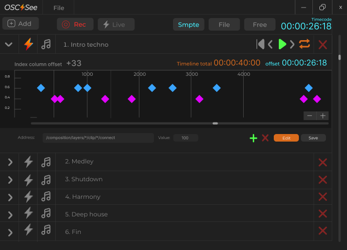
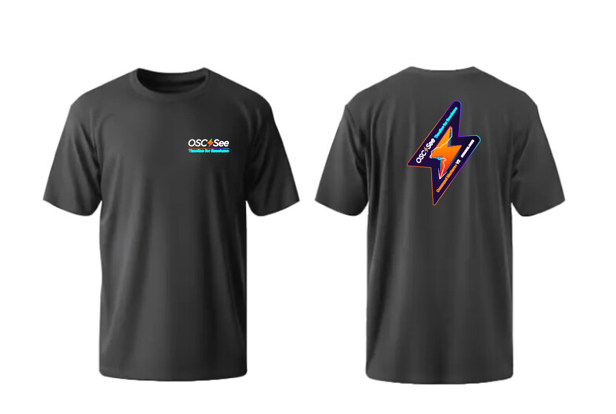
On screen, on stage, on a shirt

/brand/downloads
Take the vectors
Every lockup on this page is available as vector artwork. Download the file, place it, scale it. Do not trace it, rebuild it in a typeface, or export a screenshot of this page.

The horizontal lockup as used on oscsee.com. Live gradients, no live text.
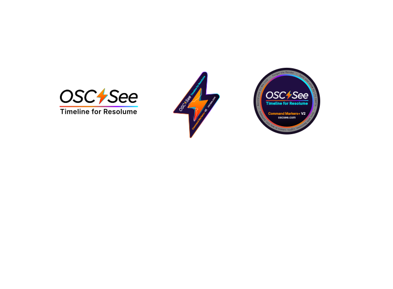
Heavier wordmark, bolt badge and circle badge on one artboard. Hotter palette, text outlined. Use for apparel, decals and any new lockup.
Need a format that is not here — EPS, AI, a two-colour separation, a cut file? Write to the team rather than converting it yourself.
/show/end
End of show
“Resolume” is a registered trademark of Resolume B.V. “Millumin” is a registered trademark of Anomes. OSC See is an independent tool and is not affiliated with or approved by either.
↑ BACK TO 00:00:00